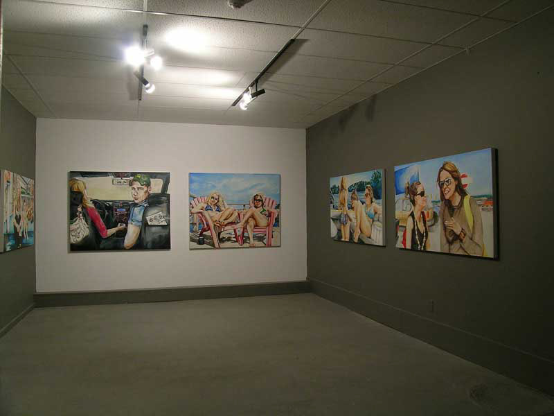
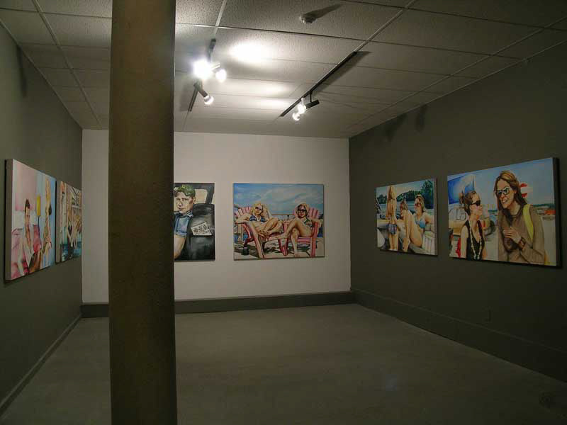

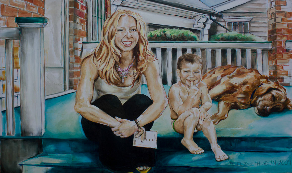
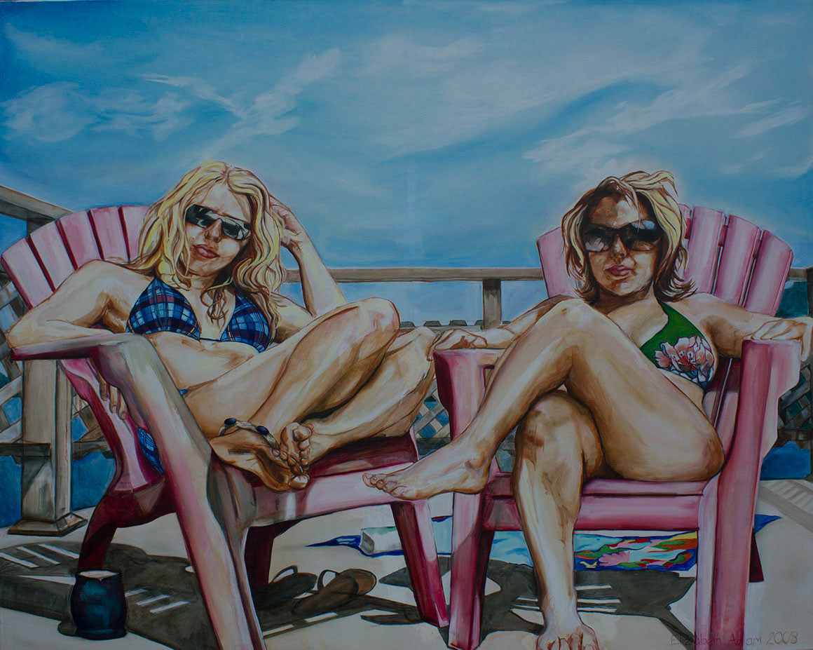
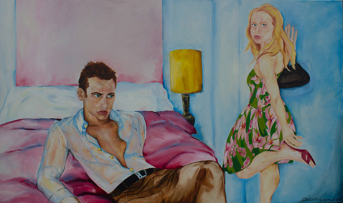
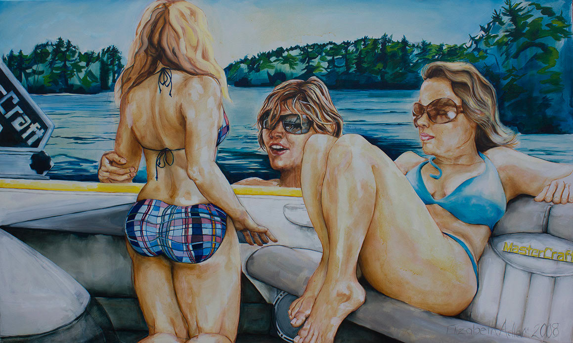
This series of paintings centres around summertime; scorching our toes on the hot city pavement before our trip up north to Muskoka, finding relief by jumping into the chilly lake at our family cottage. The vibrant swatches of colour remind me of those hot summer days lounging on the dock; skin glistening with sweat, sun-bleached hair and fantastically colourful bathing suits. Wakeboarding with friends and lounging around on the water is all a part of cottage life. The works evoke a light-hearted feeling of summer romance and fun with good friends and family. The intensity of the colours in both the photographic material and oil paintings is intended to capture the essence of warm summer days. Colour emphasizes the mood and reflects the personalities as well as my relationships with the individuals within my works. An emphasis on details result in such things as: rosy cheeks, softer features, and the perfection of each character.
I use a combination of staged photographic image material self-shot accompanied with found images. I pre-plan each image. These are based on life experiences, love and family. I use both models and myself to recreate and represent situations. While I do take photographs to be viewed as photographs, I also accumulate them as reference material for larger oil paintings. I sketch by hand all the images on the canvas to begin with which results in an image which is not intended to be completely accurate. The drawn quality in my work is very important and is maintained through to the final work. I intend not to replicate the photographic material, but instead focus on facial expressions, skin tones, and shading to bring to life the characters through layers of translucent paint in conjunction with the vibrancy of the surrounding environment.
The painting of Sarah and Stephanie reflects each of their vibrant personalities with complimentary bright swatches of colour carried throughout the painting. The blocking of shapes in the background alludes to a space without needing to be specific, adding focus to the interaction between the individuals and myself. The vibrancy of the colour comes from the layers on top of the white of the canvas showing through. This brings the characters to life and allows for a build up of layers to create realistic shadow areas. The fluidity of the paint, shadows, texture, light effects and thickness of the paint are physical tools which I constantly explore throughout my work. The physicality of oil painting is something that I greatly enjoy. Bursts of bright colours on accessories compliment the subtle tones in the complexions of the characters. The heavily saturated scenarios speak to warm summer days full of bright hues bleached by the sun.
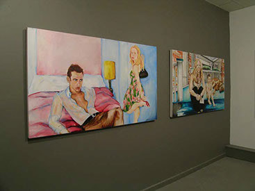
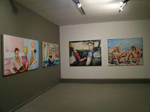
Patrick and Elizabeth, oil on canvas, 3 X 5', 2009
Jack in the Supra, oil on canvas, 3 X 5', 2009
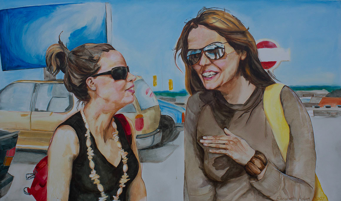
Sarah and Stephanie, oil on canvas, 3 X 5', 2007
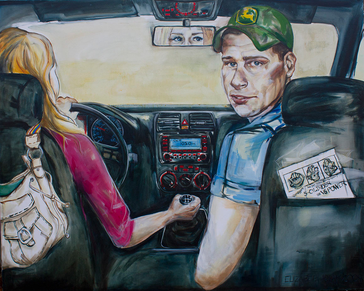
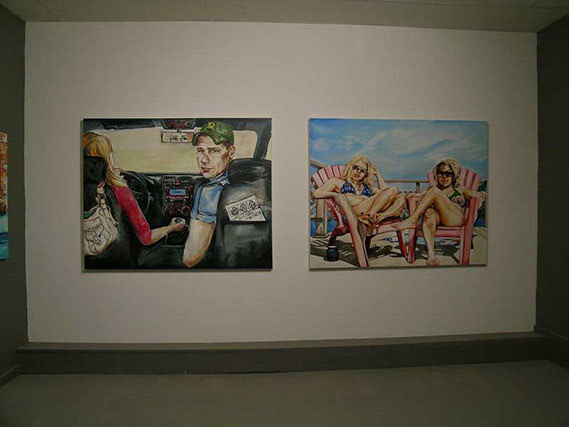
Learning to Drive Standard, oil on canvas, 4 X 5', 2009
Elizabeth and Sarah, oil on canvas, 4 X 5', 2008
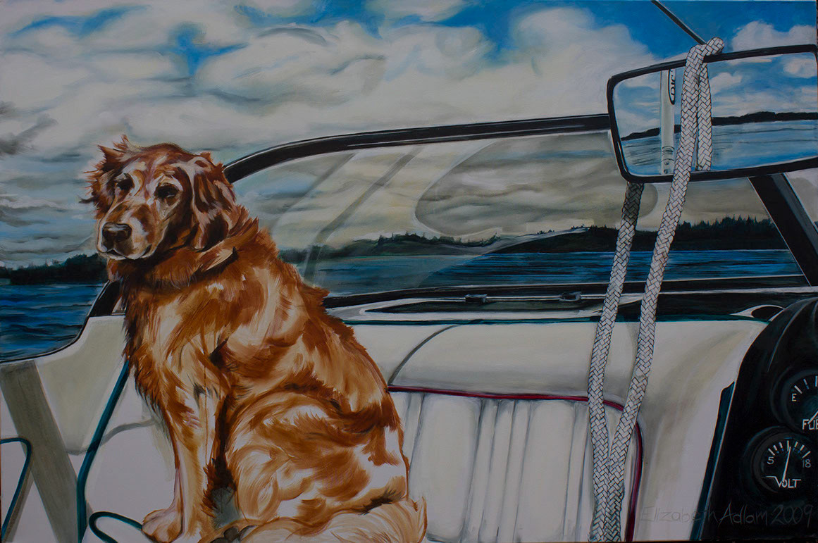
oil on canvas, 3 X 5', 2007
Summer Fun, oil on canvas, 3 X 5', 2008